This new feature for 1.5 brought a huge smile to my face.
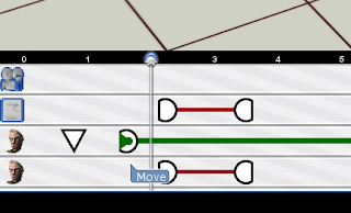
You know when you've mostly built a scene, then you realize you need to change a few things early in the scene? You shift all the activities on the timeline and that's when you find that all your carefully set up timings are now just ever so slightly off and it's immensely frustrating to get them all back again.
With the new timeline grouping feature, you can CTRL-click on several activities at once and move them all at the same time. Voila! Your timings are preserved. No more fiddly adjusting everything back to how it was.
That's going to be a huge time-saver.

Showing posts with label timeline. Show all posts
Showing posts with label timeline. Show all posts
Tuesday, 6 December 2011
Friday, 11 April 2008
Pause, take a deep breath, carry on...
It's been a long, long haul between releases this time, but the finishing post is on sight. Assuming Dick Swayze doesn't find any more last-minute nasties, 1.0.4 should be good to go early next week.
This has been one of our biggest sprints to date. Just to summarise, this release includes:
This has been one of our biggest sprints to date. Just to summarise, this release includes:
- New timeline UI
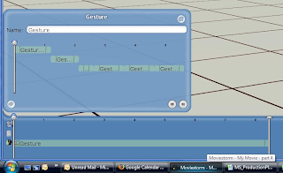
- New gesturiser UI, including gesture previewer
- Better faces
- Improved ambient shadowing
- Name tags in director's view
- Miscellaneous performance & memory improvements
- Various new features to support the upcoming Sci-Fi pack
- New start sequence
- Change to way you load movies
- New launcher and update mechanism
- New mouse bindings for set navigation
- Improved walk pathing and step animations, and less sliding around
- Better rendering, especially for close-ups
- New female faces and hair
- Guns now have muzzle flashes
- New mouse cursors to show what you can do with a prop or other object
- Pack names shown in tag browser for props
- Fixes to cutting room
- Improvements to the way props are held
- ... and a host of miscellaneous tweaks, fixes, and improvements!
Tuesday, 8 April 2008
a timeline of a new timeline
I've been spending the past few weeks months eons (on and off) rebuilding Storm's timeline. There were several reasons behind this:
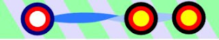
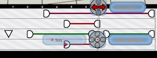
So me'n'Matt sat down and designed a dumbbell-like system. Each circle is an event in the activity and the ribbon between shows the progress of the animation (a twist for every repeat - or something).
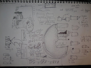
This was accompanied by a bunch of frantic doodling trying out new ideas. Cool ideas here are a zoomy-timeline (left hand side) that scales up as you mouse over it, and putting "tabs" on the top of labels so they could be brought to the front.
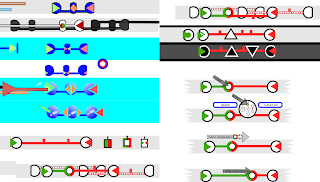
Once the basics were implemented Mitch and me disappeared into the flea-pit for a day to come up with a more complete skin. After lots of whiteboarding and inkscaping (an awesome rapid prototyping tool) we came up with a page of ideas. At this point the tube-line skin was looking good - it was very usable in particularly crowded circumstances and had a kick-ass style of it's own. We dropped the "twisty" idea: although it was great for showing you repeats, it was just too fussy and we wanted something a lot cleaner.

( tube-line is down the right hand side of this screengrab)
When you clicked on an activity a ring menu (similar to the one on set) appeared to let you manipulate each activity. We eventually dropped it because it was just too fiddly.
The next big improvement was to add labels (people couldn't tell which colour was which activity on first glance & first use) and adding texture (so peeps could differentiate between different ways of extending an activity).
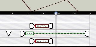
Although the dumbbells stacked well (their central line moved to show those underneath) we didn't like manipulating activities through only their end points. It always felt you should be stretching them when you were just moving them around. So we lost the big endings, and polished up some details -
Mitch did a nice set of sprites to skin the timeline and master monitor, and a bag of niggling bugs later, we were pretty much good to ship.
So, what's changed? Well, among other things.....


- The old timeline was, let's face it, ugly
- The old timeline didn't use Java's standard JComponent hierarchy, meaning it was never really going to work with the tutorial system
- Labels for activities couldn't be manipulated if they were behind one another.
- The old timeline was, let's say it again, ugly!

So me'n'Matt sat down and designed a dumbbell-like system. Each circle is an event in the activity and the ribbon between shows the progress of the animation (a twist for every repeat - or something).

This was accompanied by a bunch of frantic doodling trying out new ideas. Cool ideas here are a zoomy-timeline (left hand side) that scales up as you mouse over it, and putting "tabs" on the top of labels so they could be brought to the front.

Once the basics were implemented Mitch and me disappeared into the flea-pit for a day to come up with a more complete skin. After lots of whiteboarding and inkscaping (an awesome rapid prototyping tool) we came up with a page of ideas. At this point the tube-line skin was looking good - it was very usable in particularly crowded circumstances and had a kick-ass style of it's own. We dropped the "twisty" idea: although it was great for showing you repeats, it was just too fussy and we wanted something a lot cleaner.

( tube-line is down the right hand side of this screengrab)


When you clicked on an activity a ring menu (similar to the one on set) appeared to let you manipulate each activity. We eventually dropped it because it was just too fiddly.

The next big improvement was to add labels (people couldn't tell which colour was which activity on first glance & first use) and adding texture (so peeps could differentiate between different ways of extending an activity).

Although the dumbbells stacked well (their central line moved to show those underneath) we didn't like manipulating activities through only their end points. It always felt you should be stretching them when you were just moving them around. So we lost the big endings, and polished up some details -


Mitch did a nice set of sprites to skin the timeline and master monitor, and a bag of niggling bugs later, we were pretty much good to ship.

So, what's changed? Well, among other things.....
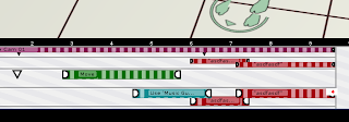
- The colour-coding on the items is now based on the type of activity, not the actor, which makes it much easier to see what's going on.
- The "grab handles" are clearer, so you know where to grab the activities. There's a new type of grab handle for some activities which allows you to stretch or loop them just by dragging (this feature is on it's way but won't be in the next release).
- Activities resize dynamically so you can fit several things on a line simultaneously and they're still quite clear.
- When an actor has to move to do an action, the walk and the action are clearly linked.
- The timeline background has a subtle pattern on, which helps you get an idea of the timescale.
- The zoom button has been moved and now doesn't look like it's there to scroll the timeline up and down.
- There's a new timeline cursor which is much clearer and more precise.
- The play controls have been superimposed on the mini-monitor to save space (will people click on the monitor instead of the play button? we'll just have to wait and see ;) ).
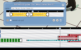
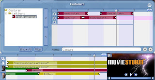
- The gesturiser UI and workflow has been completely redesigned, and the timeline in the gesturiser is now linked to the main timeline. You can only add sequences to the gesturizer that flow into each other - many less jumps in the animations.
- There's no "end of time" - you can keep on adding events whenever you like ( about bloody time)
- It's a whole lot less ugly!


Subscribe to:
Posts (Atom)