- The old timeline was, let's face it, ugly
- The old timeline didn't use Java's standard JComponent hierarchy, meaning it was never really going to work with the tutorial system
- Labels for activities couldn't be manipulated if they were behind one another.
- The old timeline was, let's say it again, ugly!
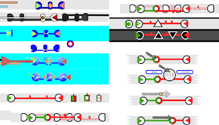
So me'n'Matt sat down and designed a dumbbell-like system. Each circle is an event in the activity and the ribbon between shows the progress of the animation (a twist for every repeat - or something).

This was accompanied by a bunch of frantic doodling trying out new ideas. Cool ideas here are a zoomy-timeline (left hand side) that scales up as you mouse over it, and putting "tabs" on the top of labels so they could be brought to the front.
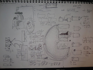
Once the basics were implemented Mitch and me disappeared into the flea-pit for a day to come up with a more complete skin. After lots of whiteboarding and inkscaping (an awesome rapid prototyping tool) we came up with a page of ideas. At this point the tube-line skin was looking good - it was very usable in particularly crowded circumstances and had a kick-ass style of it's own. We dropped the "twisty" idea: although it was great for showing you repeats, it was just too fussy and we wanted something a lot cleaner.

( tube-line is down the right hand side of this screengrab)
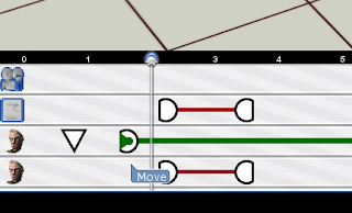
When you clicked on an activity a ring menu (similar to the one on set) appeared to let you manipulate each activity. We eventually dropped it because it was just too fiddly.
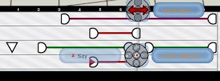
The next big improvement was to add labels (people couldn't tell which colour was which activity on first glance & first use) and adding texture (so peeps could differentiate between different ways of extending an activity).
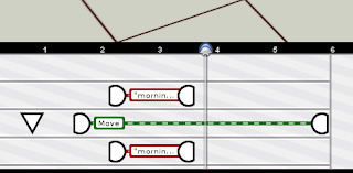
Although the dumbbells stacked well (their central line moved to show those underneath) we didn't like manipulating activities through only their end points. It always felt you should be stretching them when you were just moving them around. So we lost the big endings, and polished up some details -
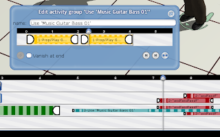
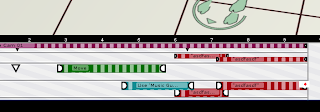
Mitch did a nice set of sprites to skin the timeline and master monitor, and a bag of niggling bugs later, we were pretty much good to ship.
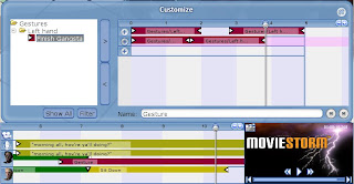
So, what's changed? Well, among other things.....
- The colour-coding on the items is now based on the type of activity, not the actor, which makes it much easier to see what's going on.
- The "grab handles" are clearer, so you know where to grab the activities. There's a new type of grab handle for some activities which allows you to stretch or loop them just by dragging (this feature is on it's way but won't be in the next release).
- Activities resize dynamically so you can fit several things on a line simultaneously and they're still quite clear.
- When an actor has to move to do an action, the walk and the action are clearly linked.
- The timeline background has a subtle pattern on, which helps you get an idea of the timescale.
- The zoom button has been moved and now doesn't look like it's there to scroll the timeline up and down.
- There's a new timeline cursor which is much clearer and more precise.
- The play controls have been superimposed on the mini-monitor to save space (will people click on the monitor instead of the play button? we'll just have to wait and see ;) ).
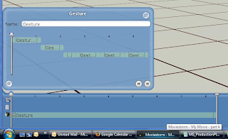
- The gesturiser UI and workflow has been completely redesigned, and the timeline in the gesturiser is now linked to the main timeline. You can only add sequences to the gesturizer that flow into each other - many less jumps in the animations.
- There's no "end of time" - you can keep on adding events whenever you like ( about bloody time)
- It's a whole lot less ugly!


7 comments:
Looks very promising :)
Yes, it does. Without using it, it's hard to tell how it will feel but the changes to the "gesturizer" alone are exciting.
Beyond the redesign, has there been any NEW functionality added to the timeline?
"Play Backward" and "Pause"? I think I love you.
:( no not much new functionality, but lots of hooks to let us add functionality in the future...
:) Hooks are good. Lots of hooks are even better.
The new gesturiser deserves a whole blog post on its own. I'm pretty much flat out tomorrow, but I'll try to put something up before the end of the week. For now, I'll just say that after getting used to the new gesturiser, I really hate it whenever I have to go back to the release version for demos!
Oh thats looks good...Keep going!
Post a Comment