Wednesday 23 April 2008

Just add music

Completely unbeknownst to me, the artists have been creating some wonderful new dance moves. Feeling somewhat funky, Ben stuck them all together (in about three minutes flat) to see how well they work. It reveals a side to Ben we never knew was there.


Groovy, baby, yeah!

Any suggestions for what music they should be singing gratefully accepted. In fact, feel free to grab the vid and stick a soundtrack on. Maybe Bryan Adams & Mel C? Why did that pop into my head?

Tuesday 22 April 2008

International talent

Sitting here in Moviestorm Mansions, I suddenly became aware of the extent to which I'm surrounded by talent from all over the world. Although Moviestorm's a British endeavour, based in Cambridge, England, we've drawn our team from far afield.

Chris is the lone Brit in the art team: alongside him we have Mitch from South Africa, Xav, who's French, and Ivan from Serbia. On the Web & community side, there's not a single Brit: John's 100% Irish, Johnnie's half Irish, Lisa's from California, and Tari is Canadian. Meanwhile QA is headed up by Dave P, who's half Polish.

Friday 18 April 2008

Back to work, minions!

The guys and gals have had a well-deserved half-hour off after getting 1.0.4 out the door, and we even kindly gave them a celebratory packet of chocolate biscuits (apart from twak who's not allowed human-type food). While they were out enjoying our phenomenal largesse, this is what we wrote on the whiteboard for them to do next.
  • Complete overhaul of camera system
  • Mark's sexy walks
  • Make the men look as good as the women
  • Face morphing
  • Character shop redesign
  • Improve the improvisor (Or is that improvise the improver?)
  • Better facial expressions
  • XXXXXXXXXXXXXXX (That one's still a secret, sorry! We have to have some surprises up our sleeves!)
  • Crime (That's a content pack, not our new business model. Probably.)
That should keep them busy and out of that nasty sunlight for a while!


Thursday 17 April 2008

The QA Department: Kings of Sarcasm

It's not easy working for the Moviestorm Quality Assurance Team. You're surrounded by fools who insist on submitting obviously broken code with a comment of "What's wrong with that? It works well enough doesn't it?" The only way to keep yourself sane is with the age-old intellectual comeback, sarcasm.

Here are a few genuine examples of helpful QA contributions to team morale:
Ben_S: Hey twak, the build you committed at half-past three is a strong contender for the title of "Most Broken Build Ever". It's even better than the one you checked in last week.

Moviestorm bug number 1242 (logged by Synnah): The majority of old movie files will now fail to load. I believe what is causing it to fail is having a camera cut in the movie. As it is currently not possible to add a camera cut (the Camera view is also borked - see bug number 1241), I can't test my hypothesis.

Ben_S: (to Dave) Can your mac build PC binaries? Because if it can, I have a job for you.
Dave: (instantly) No!
Ben_S: (to twak) Is he lying?

Ben_S: (yes, again) The new launcher program is currently hard-coded to download data from our test server. We really should remember to change that before it goes live, or we'll have successfully engineered a denial-of-service attack against our own servers. Which would be bad.

Mark: (to Ben_S) Why do you always do that?
Ben_S: Do what?
Mark: You pick the most trivial, annoying, broken thing and home in on it like a ... a ... homing thing.

Ben_S: I'm not being too demanding in asking for a build that actually starts, am I?
[insert more insulting QA arrogance ad nauseam]

And finally, a bug from our bug database that was filed by Synnah in response to the first draft of a flash video tutorial.
MS-1227: Subtitle issues with the 'Moving Around' tutorial
Steps to Reproduce:
1. Run the tutorial with Closed Captioning on.
2. Use eyes to see words.
3. Use ears to hear words.
4. Notice the frequent discrepancy 'twixt the two senses.
The issue was eventually closed, with the magnificently poetic comment:
'Pon my troth, Sirrah, mine eyes do now perceive what mine ears do attend. Verily hath thine sage council been paid want, as thine own dear merits must attest. And like an errant cur unto the bosom of his master, this issue to thine noble countenance doth request resolution.

Wednesday 16 April 2008

Nearly there....

Latest news on the 1.0.4 release - just one more bug to fix before it's ready to ship.

Mind you, they said that this time yesterday, and then QA found another one... I'm sure they do it on purpose.

Monday 14 April 2008

Once more ... with feeling!

One of the new features in Moviestorm release 1.0.4 will be the new gesturiser interface.

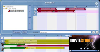
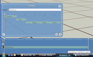
You add gestures in the same way as before, using the ring menu, but now you get this little tool - with explanatory text! To add a gesture, click the + button at the left of the micro-timeline track.


Now you get a collapsible list of all the gestures you can add. The little red arrows indicate whether the gesture is "complete" (i.e. it takes you back to the standard idle pose afterwards) or "incomplete" (i.e. there are one or more follow-on gestures you can do afterwards, like you get with most of the dance moves, for example). The gesturiser now understands these "gesture chains" properly, so you can only add gestures that follow smoothly, and you won't get nearly as many of those annoying jumps and discontinuities between animations.


There are a lot of gestures (about 2000 separate animations all told in the dev version I'm running, which includes all the add-on packs we've released, and quite a few we haven't). This gets seriously unwieldy to browse through, so if you hit Filter (at the bottom of the list) you get a tag cloud which narrows your search down.


When you find a gesture you like, click the right arrow just by the micro-timeline and your gesture pops onto the track. You can now scrub it, drag it, and so on.

To add more gestures, just keep adding to the existing track, and they'll get put onto the end, or else, as here, click the + next to a new track to have several gestures going on at once.


One new feature that doesn't show up too well (unless you click on the picture above and get it full size) is that when you click on a gesture in the list, the character performs the action. Here, Melissa's previewing a "wave". This allows you to see what you're going to get, rather than trying something and then finding it isn't what you wanted after all. It's one of those tiny little changes that means that adding performance and characterisation to a scene becomes a whole lot easier.

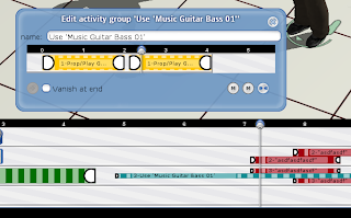
And, hidden away where nobody except twak will ever find it, is are the hooks for a cunning piece of code that will enable us - in some future release - to add in a really powerful little feature. What we're planning is to have three different ways to drag activities on the micro-timeline. The basic drag will move an activity along the timeline exactly as it does now. The two other drags will enable you to change the duration of the activity in different ways. One changes the duration of an activity, so you can do it slower or faster; the other simply repeats the activity for as long as you want. This is dead handy for things like guitar animations - you just say "play the guitar", drag it to the right speed, then drag it out for a minute or so, and you have an instant backing musician.

Friday 11 April 2008

Pause, take a deep breath, carry on...

It's been a long, long haul between releases this time, but the finishing post is on sight. Assuming Dick Swayze doesn't find any more last-minute nasties, 1.0.4 should be good to go early next week.

This has been one of our biggest sprints to date. Just to summarise, this release includes:
  • New timeline UI
  • New gesturiser UI, including gesture previewer
  • Better faces
  • Improved ambient shadowing
  • Name tags in director's view
  • Miscellaneous performance & memory improvements
  • Various new features to support the upcoming Sci-Fi pack
  • New start sequence
  • Change to way you load movies
  • New launcher and update mechanism
  • New mouse bindings for set navigation
  • Improved walk pathing and step animations, and less sliding around
  • Better rendering, especially for close-ups
  • New female faces and hair
  • Guns now have muzzle flashes
  • New mouse cursors to show what you can do with a prop or other object
  • Pack names shown in tag browser for props
  • Fixes to cutting room
  • Improvements to the way props are held
  • ... and a host of miscellaneous tweaks, fixes, and improvements!
So, we're going to award ourselves a weekend off, enjoy the sunshine if there is any, and then start work on the next release...

What's in a name?

Another of the small but important upcoming changes for the next release is.... well, look at the picture, and see if you can work out which one's Bill and which one's Ben.


In best WoW style, characters have names over their heads in the director's view. It's a feature that's been on the to-do list for - literally - years, but only just made it to the do-it-now list. Largely, I suspect, because in the words of our revered Chief Architect of the Moviestorm Universe, "you have no bloody idea how hard that was to get right". (It's true, I have no idea, and don't really want to know. He started to explain, but then I found myself coming over all light-headed and had to go and lie down in a dark room until I felt better. Anyway, it's done now, that's all I care about. Programmers are supposed to do complicated stuff and make it look easy. They don't need sleep, sunlight, or green vegetables. How else do they maintain their elitist aura of mystique and techno-smugness?)

For such a small change, it makes life so much easier, it's unbelievable. It's now completely obvious who the active character is, and you can find them on the set almost instantly. There's no more messing around with the character list trying to remember which of the extras is "passerby 1" and which is "passerby 2".

The good stuff just keeps on a-coming, don't it?

Wednesday 9 April 2008

Things you don't see

Adding new features or new artwork into Moviestorm is great. We all get to crane our necks over someone's monitor and go "oooooh". Then we make test movies which show off the new new stuff, and we can all see the results right away. And, of course, we can post nice screenies up here so you guys can go "oooooh" as well. We like that, yessir, we do. It makes us feel good.

However, a lot of what the code monkeys get up to has absolutely no visible benefit, isn't glamorous, and doesn't have any "wow factor" at all. For this upcoming release, for example, they've addressed a nagging memory issue. Whenever you switched scenes, the memory usage gradually built up, until MS was chewing up ridiculous amounts of memory and basically ground your entire machine to a halt. They've also fixed a horrid little bug where cancelling a render from a single camera could - sometimes - cause a crash. Plus they've been nibbling away at issues such as load times, graphics card support, and tiny little performance issues. Each little tweak may only improve things by 5%, so it's hardly even perceptible, but with enough of them, that adds up over time to a much faster and smoother app.

Something which is much more obvious when you're using MS, but still isn't the kind of news you go shouting from the rooftops, is that we've still been bashing away at the mouse bindings for set navigation and camera framing, trying to get something which is intuitive, consistent with what different people expect, and enables you to do all the things you need in a film tool. I don't know how many different bindings we've tried over the last two years, trying to take into account Mac users, different types of game UI, different types of 3D package UI, and so on, not to mention different people's tastes. The only way to do it is to try something, and then use it for a month or two, and see whether it "feels right" after you unlearn the previous version, and once you have any new features in and working. I've been using the new controls for a about three weeks now, and I'm finding them much better, although I do find myself occasionally reverting to the old way unconsciously. Going back to using 1.0.3 for demos feels quite clunky by comparison.

I could go on for pages, listing all the tedious and insignificant issues in our bug database that they address every day, but I'd get bored writing them and you'd get bored reading them. With around 300,000 lines of code in Moviestorm at the last count (and more every day), there are always niggling little errors to chase down and fix. And, just to add injury to insult, it's usually dealing with those evil little bugs deep down in the architecture that causes everything to fall over in a big stinking heap and stop working, at which point everyone else in the building starts to swear, curse, and bang their heads on their keyboards because their movie just broke.

It's a bug. (A stink bug, if you must know.) I just don't like posting without at least one picture. Plain text is just so 19th century!
These hidden changes aren't revolutionary, interesting to look at or world-shattering, but when you put them all together, that's how we make Moviestorm easier and nicer to use. In the background, we just keep grinding away. It's gonna be worth it.

OK, that's enough of the boring stuff. We'll have something pretty to show you tomorrow.

Spot the difference

Look closely at these two screenshots, and see if you can see what's changed between the current version 1.0.3 and the upcoming 1.0.4 release, which is currently going through final QA. (You may find it easier to click on the images and view them larger.)

Version 1.0.3

Version 1.0.4

Nope?

OK, look at the shadows under the two chairs. In the 1.0.3 version, you'll see nasty little lines. They don't look too bad in stills, but when you shoot actual footage, especially if you have moving cameras, they really look horrible. They flicker and flash, and they're seriously annoying and distracting. In the 1.0.4 version, you just have the shadows you'd expect, without the artifacts.

For the non-technical among you, this is a phenomenon called "z-fighting". What's happening is that the ambient shadows cast onto the floor by the chairs and the sofa end up in the same plane. This confuses the renderer, because it has two things in the same place. We've already eliminated a lot of the z-fighting issues, but clashing between ambient shadows is one we'd missed, as it only happens when you put things like furniture too close together.

And now it's fixed. From 1.0.4. onwards, your sets should look much nicer. It's a small fix, but one which has a huge effect on the look of your films.

Tuesday 8 April 2008

a timeline of a new timeline

I've been spending the past few weeks months eons (on and off) rebuilding Storm's timeline. There were several reasons behind this:
  • The old timeline was, let's face it, ugly
  • The old timeline didn't use Java's standard JComponent hierarchy, meaning it was never really going to work with the tutorial system
  • Labels for activities couldn't be manipulated if they were behind one another.
  • The old timeline was, let's say it again, ugly!
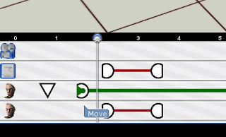
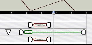
This is what we started with - the main timeline and the gesturizer -


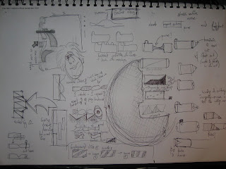
So me'n'Matt sat down and designed a dumbbell-like system. Each circle is an event in the activity and the ribbon between shows the progress of the animation (a twist for every repeat - or something).


This was accompanied by a bunch of frantic doodling trying out new ideas. Cool ideas here are a zoomy-timeline (left hand side) that scales up as you mouse over it, and putting "tabs" on the top of labels so they could be brought to the front.


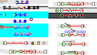
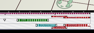
Once the basics were implemented Mitch and me disappeared into the flea-pit for a day to come up with a more complete skin. After lots of whiteboarding and inkscaping (an awesome rapid prototyping tool) we came up with a page of ideas. At this point the tube-line skin was looking good - it was very usable in particularly crowded circumstances and had a kick-ass style of it's own. We dropped the "twisty" idea: although it was great for showing you repeats, it was just too fussy and we wanted something a lot cleaner.


( tube-line is down the right hand side of this screengrab)

When you clicked on an activity a ring menu (similar to the one on set) appeared to let you manipulate each activity. We eventually dropped it because it was just too fiddly.


The next big improvement was to add labels (people couldn't tell which colour was which activity on first glance & first use) and adding texture (so peeps could differentiate between different ways of extending an activity).


Although the dumbbells stacked well (their central line moved to show those underneath) we didn't like manipulating activities through only their end points. It always felt you should be stretching them when you were just moving them around. So we lost the big endings, and polished up some details -


Mitch did a nice set of sprites to skin the timeline and master monitor, and a bag of niggling bugs later, we were pretty much good to ship.


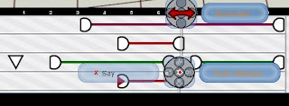
So, what's changed? Well, among other things.....
  • The colour-coding on the items is now based on the type of activity, not the actor, which makes it much easier to see what's going on.
  • The "grab handles" are clearer, so you know where to grab the activities. There's a new type of grab handle for some activities which allows you to stretch or loop them just by dragging (this feature is on it's way but won't be in the next release).
  • Activities resize dynamically so you can fit several things on a line simultaneously and they're still quite clear.
  • When an actor has to move to do an action, the walk and the action are clearly linked.
  • The timeline background has a subtle pattern on, which helps you get an idea of the timescale.
  • The zoom button has been moved and now doesn't look like it's there to scroll the timeline up and down.
  • There's a new timeline cursor which is much clearer and more precise.
  • The play controls have been superimposed on the mini-monitor to save space (will people click on the monitor instead of the play button? we'll just have to wait and see ;) ).
  • The gesturiser UI and workflow has been completely redesigned, and the timeline in the gesturiser is now linked to the main timeline. You can only add sequences to the gesturizer that flow into each other - many less jumps in the animations.
  • There's no "end of time" - you can keep on adding events whenever you like ( about bloody time)
  • It's a whole lot less ugly!
And to remind y'all how much the timeline has evolved over the years, here are some images from the archives of really ancient concepts and ideas, most of which never saw the light of day!


Monday 7 April 2008

Walk this way

Johnnie: Even though I work in the same room as most of the rest of the Moviestorm team, I'm constantly surprised by the new and exciting things that seem to pop up out of nowhere every so often. For example: Mark, our resident fastidious genius, has been sitting quietly in a corner for the past week or so, occasionally swearing loudly and cursing all computers. I didn't give it a moment's thought - that's par-for-the-course for Mark - but then I happened to glance at his monitor and I saw this:


If you're having trouble viewing this movie, you can download it from the Moviestorm servers instead.

That's right. Mark has quietly revolutionised the way that you move your characters around the set. You can now just pick up a character and drag them somewhere, and Moviestorm will automatically add a walkpath. What's more, you can drag them somewhere else halfway through the walk, and Moviestorm will adapt the walk to smoothly transition between the three points. You can do that as many times as you like. Moviestorm simply keeps a record of the walk-path curve (you can see it on the ground in the video) and adapts it as needed. No more messing around with keyframes or walk speeds or ugly stop-start turning. Now, it just works. Good, ain't it?

Before you all ask, no we don't have a release date for this yet. Sorry. It will make it into a forth-coming update though, and I don't expect it to be too far away. Patience, Grasshopper.

Thursday 3 April 2008

Cel-shaded loveliness

Commenting on yesterday's screenies of the new faces, AngriBuddhist said...

"The third picture, the one saturated in red, is beyond a doubt the most gorgeous thing I've seen MovieStorm produce."

Awww, thanks, Angri. But personally, I prefer this one.
It's basically the exact same shot as the bottom one, which we posted yesterday on the official blog, but with the cel shading turned on, a deep purple ambient light, and a strong blue directional light. 100% Moviestorm, no post-processing, no shoppery, nothing. And you should see her move...


It's one of the things I really like about using Moviestorm, that you can shoot a scene, and then go back and completely change the look and the atmosphere with just a few button presses.

Wednesday 2 April 2008

And Men Created Women

Over the last few months, we've been hearing muffled Gallic curses emanating from the cupboard under the stairs. Tempted though we were to investigate, we decided to ignore them, and see what happened. Many times we'd arrive at work to find a trail of baguette crumbs and bottles of Stella Artois strewn across the lobby.

Then one day, we found a large pile of meshes and textures, along with a handwritten note written in a language none of us understands, and a conspicuous hole where the engineers ought to have been. We tried to act unconcerned, and waited patiently to see what would happen. Three weeks later, we found them gibbering at the back of the garage, babbling strangely about renderers and fresnel highlights, and no longer able to tell the difference between a real human being and a computer-generated avatar. "We... have... created.... Woman!" they croaked.

And they had.


It's been a mammoth task. The "quick fixes" we tried last year made some improvements, but they weren't enough to take us to where we want to be.

After lots of discussion we decided to stick with the existing skeleton, largely because rebuilding that would have involved rebuilding all our animations, and that was just too terrifying to contemplate. We then created several new base head meshes, one each for Asian, African and European ethnic types, and then created old and young faces for each one. We then had to check the neck seams to make sure that all the new heads would fit onto the existing costumes and bodies correctly, and that the skin colour on the body would match the skin on the faces. And then we created a bunch of different makeups for each face.

The next job was to redo the hair so that all the hairpieces fitted onto the new heads. We decided to rethink the entire head construction, so that we would be able to make all the hats go with all the hairstyles, which would give us much more variety and flexibility. This meant completely rebuilding all the hairpieces, and made the job considerably larger than we originally intended. But it was worth it.

At this point, it was over to the programmers to build the new heads in. However, although they looked better in 3Ds Max, they still weren't looking right once we got them on set. They looked flat and lifeless. The solution to this involved building a new renderer so that we could get the right level of shininess onto the eyes and onto the tops of the heads and eyebrow ridges. The team came up with several new shaders, which really made a difference, but at a significant cost in framerate. At this point, the models went back to the artists, so they could add in more shine and texture and make use of the new shading, while the engineers worked out how to speed everything up so it ran as fast as before but looked better. And, of course, it had to look good with and without the cel shader.

And that's roughly what you see now. But there's more yet to come. We're working on the hair to make it smoother and more translucent. This has involved going back to the hair again and working out whether to use scissor blend or alpha blend for each hair type, and writing yet more bits of rendering code to handle that. The hair is now pretty well working - expect some more screenshots later this week.

We've got some basic morphing tools in development, and now we can give our characters bigger or smaller noses. The challenge is to make that compatible with the animations and props such as glasses: if we know the size of a character's nose, it's easy to make her touch the end of her nose, or kiss without digging her nose into her man's cheek. Once the nose size changes, all the pre-canned animations could go wrong, and we could have horrible intersections or misses. Apply the same logic to the size of the cheek, the jaw, the eyebrows, or the shape of the skull, and you have a whole bunch of pain.


Developing the faces really shows the way that this type of product development is a symbiosis between design, art, and programming. Obviously, great art doesn't get you far unless the code is there to make it look good, and no matter how good your engine is, the quality of your art is critical. And most importantly, at the end of the day, our faces have to look good in movies, under different lighting conditions, while talking or looking around, and in close-up. They're not game characters, they're animated 3D movie actors, and this has meant finding a new way to make them versatile, appealing and interesting.

So yeah, it's taken a while, but it's been worth the wait.

(More screenshots in the Moviestorm forums - restricted to early beta testers only.)

Tuesday 1 April 2008

Moviestorm Idol - picking the winners

Judging competitions for music videos is always bound to provoke controversy. You have to put your musical prejudices aside and look at the film-making skill that went into creating the video. It's not about whether the director picked a piece of music you like. However, none of our judges threw glasses of water over each other or stormed out in an artistic huff, so I guess it didn't go too badly. And I'm sure Johnnie will be back from Casualty shortly.

These are the two eventual winners: Spong3y's in-your-face nu-metal Down with the Sickness, and Zuckerman's utterly gorgeous jazz piece Horn Section. They couldn't be more different, but they really show the versatility of what you can do with the Moviestorm music packs.


Down with the Sickness - Feat Storm


Horn section